How to Use SEC Filings in Market Intelligence – A Case Study for Google Cloud

The Technical Infrastructure team at Google Cloud recently came to our school with a question about the scale of its biggest competitor, Amazon Web Services (AWS).

To summarize, Amazon recently swapped out the depreciation schedule of its servers from 3 years to 4 years, straight line. This is a big deal since extending a depreciation schedule means significantly less reported expenses each quarter while that change takes effect. Specifically, they reported a difference of $800 million for the next quarter alone.

It turns out you could actually work out a lot about Amazon’s server spending by just crunching some numbers over the past 7 years. In short, you could estimate the portion of capital expenditures allocated to servers by calculating what spending schedule would sum to the $800 million figure (assuming that the depreciation change was implemented) and work backwards. Sounds complicated, but it’s easier than you think.

So here’s the $800 million accounting question: From that figure and other publicly available data (SEC filings, earnings statements, industry reports, etc.), would it be possible to reverse engineer how much Amazon spends on their servers, and thus, get an idea of how many they currently have in their fleet?

This problem was the impetus for our school hosting a 6-hour hackathon with Google to see who could come up with the best answer. We eventually took home first prize (go team Lime Green)! Here’s what we did.

Theory & Background

Why does Google want this info? A good estimate of AWS’s scale could help a competitor understand where they stand in terms of theoretical capacity (not just market share), how they compare in spending, and make predictions of an approximate rate of expansion through a time series.

In turn, AWS is fairly secretive about exactly how many servers they have and where their data centers are even located. I mean, why wouldn’t they be?

Despite this, we can derive a pretty good estimate using figures from their SEC reports and, crucially, that figure they released in their most recent earnings call (the $800 million effect). If we set that as a constant, we can do some basic Excel math to work backward and approximate each quarter’s spending on servers. From there, we can estimate the server fleet size by dividing that spending by approximate cost-per-server adjusted by year (server costs have changed a lot since 2014).

It’s far from perfect, but it’s not a bad starting point for uncovering market intelligence intended to be kept hidden using data that’s widely available. Here’s the idea:

  1. Using past 10-Q reports, scrape Amazon’s capital expenditures (CapEx) for the past 3 years/12 quarters (those affected by the accounting change). The idea here is that server spending will fall under CapEx, but the breadth of that category usually “hides” it with other expenses.
  2. Calculate how much each quarter’s depreciation expense would be affected by the change in schedule. e.g. if it was purchased just last quarter, it would change from the total 3 to 4 years remaining or 12 to 16 quarters. If two quarters ago, then it would change from 11 to 15 quarters, and so on.
  3. Make an assumption about relative spending. There’s too many unknowns since we don’t know what portion was spent on servers within each quarter. The simplest is to assume that the percent CapEx allocated to servers is constant. There are other possibilities, though adjusting this parameter doesn’t turn out to be that important compared to the other assumptions.
  4. Finally, determine a moving estimate of the average server cost for a firm like Amazon based on various assumptions (how long servers last, OEM server manufacturer averages, how long it takes to expense them, potential fixed costs, where/how AWS servers are manufactured, etc) and market trends adjusted for each year. Divide and get an estimate for server fleet size. Done!

Writeup

Okay, let’s see it in action. What follows is a slightly edited version of the deliverable that won us the hackathon. If you want to follow the modeling aspect, you’ll also need this excel sheet (171 downloads ) .

We only had six hours to write in the actual competition, but we had the chance to refine some things afterward in preparation for a presentation with the Google Cloud team. Thus, there’s also extra considerations like subtracting the cost of server racks and adjusting for DRAM prices (the main cost-driver of servers):

Estimating the Scale of Amazon’s Server Operation

A Market Intelligence Report based on SEC Filings, Earnings Statements, Industry Reports, and Other Public Information


Submitted for Consideration in the 2020 MQM Forensics Hackathon

Team Lime Green – Shay Xueyao Fu, Shangyun Song, Yingli Sun, and Alex Zhou

What We Know


Amazon recently extended the depreciation schedule of its servers from a straight-line 3 years schedule to 4 years, which will result in an $800 million decreased depreciation expense. Amazon’s total quarterly capital expenditures are made publicly available from SEC filings. AWS currently accounts for about 71% of Amazon’s operating profit. 

IDC-published results put ODM servers at an average cost of $6,486.55 each for Q3 of 2019, which are about in line with recent averages for x86 server selling prices. AWS uses custom-made white box systems (likely designed in-house and produced by an ODM) and is even building a repertoire of custom silicon for servers, likely driving unit cost down. From the same published results, we can obtain the total revenue and market share of key players and ODM direct sources in the server market for each quarter.

What We’ll Assume


Since we cannot isolate the relative CapEx set aside for servers in each quarter by Amazon based on SEC filings, we assumed two possible spending schedules: a constant-rate schedule and a market-adjusted schedule. The constant schedule makes the simplest assumption that Amazon’s server spending does not change much year-over-year.

The market-adjusted schedule uses trends in ODM server revenue by quarter and adjusts Amazon’s predicted spending based on this growth, as well as considering the growth rate of AWS availability zones and the change in DRAM pricing. Additionally, we subtract the cost of racks and network switches from the CapEx in both schedules when we calculate the number of servers.

While this assumption is not perfect and Amazon’s spending could differ from market trends, this helps to account for explosive growth in the ODM server market (which is driven not in small part by AWS). The ODM market’s expansion, combined with nonlinear revenue growth for AWS in recent years, gives us reason to challenge a constant percent assumption for Amazon’s server spending. We provide estimates based on both assumptions in our appendix.

What We Found


Using the $800 million decrease, we estimate Amazon’s percent CapEx spent on servers to be 53.03% based on the constant-rate schedule and 47.34% from the market-adjusted schedule. Over the past 6 years, we estimate Amazon’s server spending to total $28.23 billion according to the constant-rate and $25.20 billion with the market-adjusted rate. Adjusting for average ODM server prices starting from 2014 and assuming an average useful life of 7 years and using both a floating/constant server price, Amazon currently has approximately 4.9 to 5.5 million servers in operation. This is in line with another estimate we produced based on the approximate amount of servers per data center per availability zone.

Appendix

Percent of Amazon’s (and/or AWS) CapEx spent on servers

We created two excel models and used Solver to find the base percent of Amazon’s CapEx going towards servers. CapEx was set as the “purchases of property and equipment, including internal-use software and website development, net” from each quarterly and annual filings’ consolidated statements of cash flows.

The first model was based on the Amazon quarterly CapEx spending which can be found from Amazon websites under investor relation. The second model considered the market adjusted schedule taken from the total revenue of the ODM server market from IDC, as well as considering the growth rate of AWS availability zones and the change in DRAM pricing.

Reference used:

Fixed percent of CapEx on servers:

Market-adjusted floating percent of CapEx on Servers:

How Much Amazon has Spent on Servers over the Last 6 years

We used the base rate calculated from question 1 multiplied by the yearly CapEx spending found from Amazon 10k.

Reference used:

Number of Servers AWS Currently Has in Their Fleet

We must assume servers last between 5-8 years (competition guidelines). We’ll pick the higher end of this scale due to Amazon’s lengthy tenure in the server market and simplify calculations by choosing a constant server lifetime of 7 years. This means all servers purchased from 2014 (and no earlier) should still be in operation today.

We used average ODM server prices from each year starting from 2014 to estimate the cost Amazon paid to their manufacturers. We also considered adjusting the CapEx spending for network switches and racks to calculate the number of servers.

Another way to estimate server count is to use the number of server availability zones (69) and then approximate the number of datacenters per availability zone and the number of servers per datacenter. Estimates given at a conference by AWS engineer James Hamilton place the range of servers per data center at 50,000-80,000, and the number of centers per availability zone somewhere between 1-6. We still need to consider the cost of racks and network switches that are recorded as servers. From these ranges and educated guesses from the article, we can determine a current server count using the number of availability zones.

69[1 to 6 DCs/AZ][50000 to 65000 Servers/DC] = 3.4  million to 26.9 million servers

This upper bound of the base estimate is likely high since newly established AZs should have fewer average data centers than the ones referenced when the article was published. Each data center should also have fewer than the maximum number of servers as they ramp up. Likewise, our final estimate based on the financials resulted in 4.9 to 5.5 million servers, depending on whether or not we adjusted for ODM server prices in the market and other uncertain factors.

The calculation can be found at the screenshot attached to question 2 and our Excel workbook. 

References Used:

U.S.-Mexico Immigration Will Soon Be a Climate Change Issue

Greenhouse gas emissions originating from wealthier nations are causing desertification that’s making land in the tropics infertile and, in some cases, outright unlivable.

By Michael Zingone and Alex Zhou

(This article is a cross-post with a Medium article I published for my school’s Winter Data Competition. We were later reached out to by Analytics Vidhya so it could be used under their Medium publication!)

Introduction

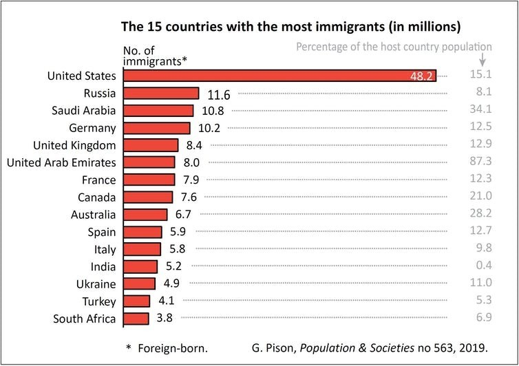
The United States has the largest foreign-born population of any country in the world. The next largest, Russia, hosts a migrant population nearly five times smaller, setting the U.S. apart as a genuinely special case of international movement. Historically, the largest sending country of immigrants to the U.S. has been Mexico by an overwhelming margin, with more than 24% of the entire Mexican population worldwide currently residing in the U.S. (that’s including all Mexican-origin people currently living in Mexico).

Image: Gilles Pison, based on United Nations data

To understand why one way Mexico-to-U.S. immigration is so common, we would do well to examine the U.S. immigration policy, which has been known for extending preferential treatment to family ties. This policy, combined with a particularly lax historical definition of family, has led to our significant migrant population and global notoriety for being a relatively open-borders nation. Between 1980 and 2000, the number of Mexican-born people in the U.S. shot up by 450%, even as our borders became increasingly militarized.

It is critical that we eventually arrive at a satisfying and fair resolution to the immigration question — not only for the 11.1 million undocumented immigrants currently residing within our borders, but for their families, friends, and others who are affected by their uncertain status and the intense, highly partisan debate that surrounds it.

Why Migrate?

Many theories have emerged to explain why the southern U.S. border is the most often crossed international boundary in the world. There are a variety of socioeconomic factors that contribute to making migration to the U.S. particularly attractive. However, in this article, we’ll examine a small but steadily growing body of research that reveals a surprising, oft-overlooked factor in the decision to migrate from Mexico: climate change.

The argument is actually very simple — so simple, in fact, it’s almost surprising that it hasn’t been discussed more: First, we know that climate change has already measurably altered annual weather patterns, and that these effects are more pronounced for nations closer to the tropics (despite those nations having contributed least to the problem). We also know that extreme weather and rising temperatures can reduce crop yields through desertification and natural disasters. Intuitively, we should then also predict that this reduced farming viability will lead to farmers looking for work elsewhere, possibly even across international borders, and likely taking their families along with them.

If true, the implications of this climate-driven migration theory are substantial. First, understanding this theory would do much in the way of fighting anti-immigrant sentiment, seeing as how wealthier countries are largely responsible for the emissions that are causing climate change, which will disproportionately affect tropical countries with less resources to handle extreme weather in the first place; if high levels of immigration are a scapegoat for other internal problems, we would be at least partly to blame.

Second, it would indicate that anthropogenic climate patterns have likely already influenced global movement, since average temperatures across the world have measurably risen from human activity. Third, we would be safe in adding further human displacement to the growing list of predicted consequences of future global warming.

Analysis and Predictions

Our analysis first sought insight into possible correlations between crop yields and immigration patterns from Mexico to the United States. The data we used in the analysis to follow comes from two sources: a MigrationPolicy.org article providing state level data on Mexican migration to the U.S. from 2004–2015 and Ureta et al.’s research paper detailing Mexican corn crop yield over the same time period.

We selected corn as the crop of interest for two reasons. First, corn is by far the most important crop grown in Mexico, accounting for about 60% of its cropland. Second, a study on the effects of temperature increases on crop yields found that corn/maize is most temperature-sensitive out of all the major crops. These facts, combined with the unique case of Mexico-to-U.S. immigration, make the country an especially interesting target for climate migration analysis.

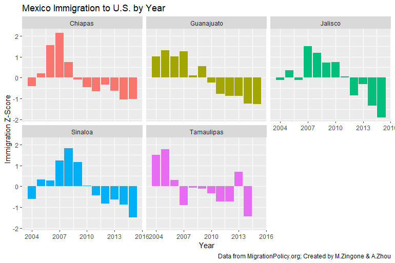
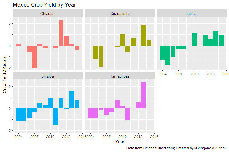
We first explored the data through visualizing standardized immigration and standardized crop yields from 2004–2015. The below two charts illustrate these time-series trends for five major Mexican States for which we had data.

The state-specific trends here are striking. For every state, the peaks in immigration — generally speaking — correspond to the lows in crop yields. In other words, when the harvest doesn’t do well, people seem to want out.

Crop yields, by definition, are a measure of land efficiency. It measures how much crop was produced per given area of land. This efficiency metric allows us to compare yields over time in case the absolute farmland area used has changed. It also allows us to avoid the conflating the relationship between immigration simply reducing the overall agricultural workforce with environmental crop efficiency affecting outward migration.

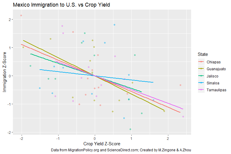
To further investigate this relationship, we plotted the standardized immigration and standardized crop yields against each other. The results below show a clear trend: the lower the crop yield, the higher the immigration in that particular year.

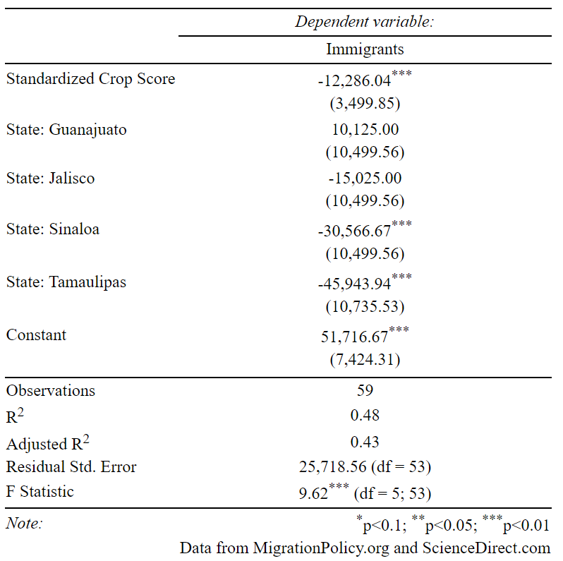
Finally, we ran a simple linear regression to predict immigration based on crop yield (standardized), including States as dummy variables in our model. The results show a statistically significant relationship between crop yields and immigration, accounting for State-specific immigration trends.

Per the model above, we see that for every one-unit increase in the z-score of crop yield, we can expect, on average, approximately 12,000 fewer immigrants from Mexico to the United States. Conversely, a similarly sized decrease in crop yield would indicate an expectation of ~12,000 more immigrants. Standardized crop yield is a statistically significant variable at the 0.01 level of significance. While we are unable to definitively establish a causal relationship due to the limitations of this study, we can conclude there is evidence of a strong relationship between crop yields and immigration patterns.

Final Thoughts

If we utilize previous established estimates of a decrease of 7.4% in corn yields per increase of a degree celsius, we would arrive at a projected decrease in corn yields of around 6.66% to 16.28% by 2025, and up to 29.6% by 2050 (based on current best estimates of warming in Mexico). Based on our model, these reductions in crop viability could displace an additional 50000 people per year based on decreases in crop yield alone.

Of course, there are many limitations to extrapolating this prediction, but the above analysis and past studies have painted a dire picture of what’s to come for climate-related displacement in Mexico and globally. However, there are many ways that governments could help mitigate some of the displacement that we predict will be caused by climate change.

In fact, there’s evidence to support that Mexico is already aware of the issue and is looking for solutions. Mexico is the only developing nation that has submitted three national communications to the United Nations Framework Convention on Climate Change, showing a strong administrative interest in addressing climate-related issues.

To formulate an effective plan, it will be crucial for governments to understand exactly how climate change can affect crop yields. According to its Third National Communication, Mexico is expected to undergo the following meteorological changes pertinent to agriculture:

  1. Increases in temperature — by 2025, projected temperature increases in the summer are in the range of 0.9 and 2.2°C, and up to 4°C by 2050. These temperature increases will especially impact the Central and Northern parts of the country (for reference, Zhao et al. found that just a 1°C increase in temperature corresponds to a −7.4% average decrease in Maize production, Mexico’s most important crop by far).
  2. Reduction in precipitation — rainfall is projected to decrease by around 5% in the Gulf and up to 15% in Central Mexico by 2025. By the end of the century, these changes will result in a decline of up to 9.16% in the available water for groundwater recharge and runoff by the end of the 21st century.
  3. More frequent and severe extreme weather events — severe storms and droughts will increase in number and intensity. By 2025, sea water temperatures will rise between 1 and 2°C, leading to stronger and more intense tropical hurricanes in the Caribbean Sea, the Gulf of Mexico and the Mexican portion of the Pacific Ocean, with a projected increase of 6% in wind intensity and an increase in precipitation of 16% within a radius of 100km from the center of a hurricane.

Former Mexican president Felipe Calderón said, “Mexico is uniquely vulnerable to climate change.” The country is losing 400 square miles of land to desertification each year, forcing an estimated 80,000 farmers to migrate. The country is also facing intense flooding, especially in the state of Tabasco, which decreases water supplies, and an increased hurricane risk as a result of climate change.

Even as Mexico passes legislation (e.g. the Migrant Law amendments in 2012) that eases processes for immigrants from Central America to enter the country, the U.S. has been making it increasingly difficult to enter, removing more unlawfully present immigrants and scaling up efforts to catch recent arrivals close to the border. The U.S. deported a record 409,000 immigrants in 2012.

Countries that are closer to the polar regions, which are projected to be less affected by climate change, should begin to prepare for an influx of migrants seeking refuge from extreme weather, natural disaster, and poor crop viability due to climate change. In particular, the US may want to extend the protections of the Temporary Protected Status (TPS) to apply to climate change-related effects, rather than the narrow scope of natural disaster and armed conflict.

People have a plethora of reasons for migration. In the case of Mexicans immigrating to the U.S., reasons can range from political tensions to economic downturns or, as shown through this analysis, varying crop yields. As global warming impacts Mexico in the coming decades, agricultural viability — or a lack thereof — will continue to become a more pressing issue for the average Mexican citizen. Climate change will surely impact future generations in more ways than we can predict today. One thing for certain, however, is that immigration ought to be on the forefront of topics discussed regarding our changing climate.

Calculating the Nutritional Content of Popular Online Recipes

I just started business school at Duke University two months ago, and it’s been amazing! I feel like I’ve already made lifelong friends, and there are lots of great events to kick things off with the business school as well as fun things to do in the Raleigh-Durham area.

Our program, the Master of Quantitative Management (MQM), recently hosted its Summer Data Competition. The basic idea was to produce an interesting data set (ostensibly not including any insights taken from it) using any means available. We’d be judged on criteria like originality, cleverness, and usability/potential for insights – of course, demonstrating that potential means performing at least some analysis yourself…

An entry I made with my friend Mayank ended up making it into the finals. I thought the idea was really cool. Here’s what we did:

Premise

“Pick two.

Like many students, I’ve been trying to maintain a good diet on a low budget, and I’ve come to notice a basic, inescapable dilemma for all eaters. Basically, you can eat cheaply, eat healthily, or eat out. Pick two. Students/early career folks like me generally end up sacrificing the convenience and time savings of having someone else make our meals in favor of cost savings.

If we’re lucky, we also get to maintain our overall health. It’s obviously not guaranteed you even get two of them. The broke college student chowing down on instant ramen every night is a cliché for a reason.

There are a plethora of reasons as to why it could be difficult to cook healthy meals for yourself all the time, especially when you’re low on ingredients, money, or you have to follow some specific diet or nutritional guidelines. But sometimes, it’s just because it isn’t obvious which recipes are healthy or not just by looking at the ingredient list. You might notice that the vast majority of recipes don’t include nutrition facts, and the ones that do have narrow selections and mostly include health-first, taste-second recipes. That’s no good.

A lack of easily accessible basic nutritional information for common recipes should never be a reason to sacrifice your health. We thought that, with some simple data transformations, it would be possible to scrape nutritional information for recipes online.

Introduction

Our dataset focuses on the nutritional profiles of publicly available food and drink recipes on various popular culinary websites; we chose to focus on US-based recipe catalogues to avoid language confusion and to ensure a stronger cultural grasp of the recipes we analyzed.

The record is arranged into 2976 rows and 19 columns, with each row corresponding to a given recipe entry. Five columns are reserved for recipe metadata (e.g. title, average rating, url, etc), and the remaining are nutrition based. We used the USDA Food Composition Databases API to access nutritional information for each ingredient, then applied natural language processing techniques to parse the units of measurement according to each recipe – think pounds, cups, teaspoons, or grams – and converted each to a mass standard that the API could retrieve.

Data Acquisition

While the data acquisition process was relatively straightforward in principle, our team had to overcome significant technical hurdles to obtain the recipe data and convert it to useful nutritional information.

First, we needed to design a web crawler that found directories in target websites that matched a particular signature pointing only to recipe pages. After tinkering for a while, we found that most of the sites we tested had a “recipe” tag in their url path that made this distinction obvious. We used dirhunt, a command-line open source site analyzer that attempts to compile all directories while minimizing requests to the server (Nekmo).

Here’s what “dirhunt” looks like in action. There’s a lot of blog posts/stories we don’t want, but we can filter out the second to last URL sections that include “recipe” to get actual recipes we can use!

Next, we needed to scrape the data from each recipe URL. We ended up using recipe-scrapers, an open-source Python package for gathering basic data from popular recipe site formats (hhursev). This package gave us easy access to the recipe titles, average ratings, and ingredient lists, among other important data.

Critically, the ingredients were formatted as a Python list of strings in their raw delineation. For instance, one item could look like “1 1/2 cups unbleached white flour”. We needed to first convert the “1 1/2” into a proper floating point, as well as change all measurements into the standard grams that the USDA nutritional database requires. Python offers a “fraction” package for converting strings of fractions into floating point numbers, as well as a “word2number” package for converting strings to numbers (e.g. “three” to 3).

We wrote a lookup table for converting all masses into grams, as well as all volumes into grams based on the ingredient type. For volume-based ingredients not found in our lookup table, the script defaulted to using the conversion factor for water (approx. 240 grams per cup), which proved to be a close estimate for a wide range of food types – most food is mostly water!

Finally, we used the USDA Food Composition Databases API to search for these ingredients and obtain nutritional data. The API allows for searching with natural language, though some foods were still impossible to find through the API; we decided to discard any recipes that had untraceable ingredients given the time restrictions of the competition.

The request limit on this API also meant that we were realistically limited to a few hundred recipes per site for our final dataset; we decided to spread relatively evenly over the sites to include a wide range of recipe influences.

Dataset Description

Recipes-Meta is a database of recipes scraped from popular websites with computed detailed nutrition data taken from USDA for each ingredient to potentially help consumers make more informed eating choices and offer insights in the relationships between ingredients, nutrients, and site visitor opinions. Each row is a recipe entry that can be uniquely referenced by its URL.

Columns:

Title: Name of recipe 
Rating: Average rating of recipe as given by users (some sites do not have this feature)
URL: Web address of the recipe (unique/primary key)
Servings: Number of people the recipe serves, i.e. serving size (nutrition data is divided by this)
Ingredients: List of ingredients in the recipe
Energy (kcal): Total calories of the recipe per serving in kcal
Carbohydrate, by difference (g): Total carbohydrates of the recipe per serving in g
Protein (g):
Total protein of the recipe per serving in g
Calcium, Ca (mg):
Total calcium of the recipe per serving in mg
Cholesterol (mg):
Total cholesterol in the recipe per serving in mg
Fatty acids, total saturated (g):
Total saturated fat of the recipe per serving in g
Fatty acids, total trans (g):
Total trans fats of the recipe per serving in g
Fiber, total dietary (g):
Total dietary fibre of the recipe per serving in g
Iron, Fe (mg):
Total iron content of ingredients used in the recipe per serving in mg
Sodium, Na (mg):
Total sodium of ingredients used in the recipe per serving in mg
Sugars, total (g):
Total sugar content of recipe per serving in g
Total lipid (fat) (g):
Total lipids/fats of the recipe per serving in g
Vitamin A, IU (IU): Total Vitamins A of the recipe per serving in IU
Vitamin C, total ascorbic acid (mg):
Total Vitamin C of the recipe per serving in mg

  • Red indicates nutrition related data
  • Blue indicates recipe related recipe related data

Potential Insights

There exists a critical gap between growing consumer demand for health-conscious eating options and readily available nutrition data for recipes online. Most consumers looking to eat balanced, tasty, and affordable meals while meeting their health goals must eventually learn to cook their own meals. However, convenient data to make informed choices for recipe-based meal planning does not exist for most popular recipe sources online.

We also noticed that the few websites that do show nutrition data for their recipes are geared towards consumers that already follow a diet plan or practice healthy eating as a part of their lifestyle. Further, these websites are often limited in scope, including only a small set of specific recipe choices or community-generated recipes from a small user base.

Considering that access to healthy eating options and food education in America is growing increasingly unequal, our approach to spreading awareness about nutrition aims to target the ‘average eater’ or general public (Hiza et al.). This requires us to access nutrition data for a wide range of popular websites, rather than the few that readily offer this information. While our algorithm is not perfect, it can serve as a starting point and proof-of-concept for similar endeavours in the future.

We suggest the following potential insights, though there are many more viable routes for analysis:

  1. Determine if “healthiness”/nutrition stats somehow relate to the average rating of recipes. 
  2. Generate a custom list of recipes that fit a specific range of macronutrients (protein/carbs/fats).
  3. Define overall nutrition metrics in all recipes, for example, to find meals that have an especially high protein to calorie ratio.
  4. Check if recipes that include certain ingredients tend to be more or less healthy.
  5. Analyze which websites tend to post healthier and/or more well balanced recipes.
  6. Produce a nutritional ranking of all recipes according to their adherence to USDA guidelines (or some other metric).
  7. Flag recipes with especially high sugar, fat content, trans fat or cholesterol content and make this flag obvious if and when it is retrieved.
  8. Write an algorithm that generates customized eating plans that meet daily nutritional requirements.

For a more business oriented goal, this data could be integrated with personalised consumer-level data to design customized eating plans that follow individual nutritional requirements based on height, age, weight, BMI, or other factors. There are surely many interesting possibilities we did not discuss in this report. Happy hacking.

Sources

Hiza, Hazel A.B. et al. “Diet Quality of Americans Differs by Age, Sex, Race/Ethnicity, Income, and Education Level”. Journal of the Academy of Nutrition and Dietetics, Volume 113, Issue 2, 297 – 306.

hhursev. “recipe-scrapers – Python package for scraping recipes data”. Github Repository, 2019, https://github.com/hhursev/recipe-scrapers.

Nekmo. “Dirhunt – Find web directories without bruteforce”. Github Repository, 2019, https://github.com/Nekmo/dirhunt.

Recipe websites referenced:

https://cooking.nytimes.com/

https://allrecipes.com/

https://epicurious.com/

https://seriouseats.com/

Chasing Clouds – An Airborne Radar Live Visualization System


Last summer, I moved into a cramped Airbnb in Pasadena with two roommates to work at Caltech’s amazing Jet Propulsion Laboratory (JPL). I tinkered with an airborne radar system‘s visualization system, taking it from slow and static to streamlined and dynamic with a custom built Python data pipeline and GUI. I thought the whole project was pretty interesting, so here’s what went into it.

Some Background

The JPL research site, a joint venture between NASA and Caltech, is mostly known for its combination of cutting-edge space exploration and robotics technology. The intern experience at this site is famous for being interactive, memorable, and not like any other internship.

Image result for jet propulsion laboratory
Source: JPL website

The team I worked with, the folks responsible for the Airborne Third Generation Precipitation Radar (APR3), loads big and complicated radar systems onto research aircraft and sends them to far away places. They do this to measure cloud precipitation and study things like extreme weather, the effects of slash-and-burn agriculture and other polluting land uses on precipitation, and the general impact of aerosols on climate. 

In previous missions, the APR3 radar was simply “along for the ride.” In other words, the actual direction of the aircraft was decided by a different research team working with a different tool. Essentially, the APR3 team just requested when the radar be turned on/off and took a look at the data using in-house code after each trip.

However, APR3’s next trip would be at the end of summer 2019 over the Philippines shortly after my internship as the principal instrument; that meant it could direct the plane as it flew.

Furthermore, for this experiment, they wouldn’t have a plan beforehand of where to fly until the radar went live and was in the air. They only knew what precipitation patterns they were looking for. Basically, they had to go cloud chasing.

The problem was that, for almost all the relevant decision=making data, their custom-built visualization program (originally written in MATLAB) was only capable of reading in files after each flight, not during. And it was slow, meaning you couldn’t really just tediously reopen files as it flew to approximate a live feed.

My summer was spent designing something better.

The Cloud Chaser

Taken on my first visit to the lab, around 2018

When I was at JPL, I called my homegrown visualization package “APR-3 Meta”, which sounds really legit and let me submit weekly official-looking reports to government employees. Now that we’re in my blog, I can call it whatever I want. I’m going with Cloud Chaser, because the idea of going through so much trouble to chase down clouds is pretty funny.

Cloud Chaser was intended to be a comprehensive Python-based upgrade to their current viz system, which was done entirely in MATLAB. The downsides to MATLAB (and the onboard viz program generally) were numerous:

  1. It needs a license! The license is crazy expensive and we couldn’t rely on the JPL site-wide license since that needed to be consistently verified online. There’s no guarantee of internet halfway across the world and 80,000 feet in the air.
  2. The scripts had loads of confusing cross-referencing and redundancies. It was built over countless iterations to satisfy all sorts of functions that it didn’t need anymore for the new mission. Lots of scripts were separated for no clear reason (little reusability, tons of redundant lines). It was also slow, and had lots of bottlenecks in nested for loops that weren’t needed, especially after being rewritten in Python.
  3. Critically, the program lacked any live-update features for many relevant flight parameters.

To solve these problems, we decided that it would be best if I just rewrote the entire thing in Python, which is open-source and has advantages in its wide range of free visualization packages and optimizations with vectorized code.

The main difficulty in this project was the time and manpower limit. Some interns got to work in groups, but the radar team only requested one intern, so it was just me! I only had about two months to learn MATLAB, rewrite the code that translated the binary feed from APR3 to usable data, and figure out how to make a pretty GUI in Python that also gave critical info to airplane operators in potentially extreme weather situations.

Luckily, I also had access to a great team of mentors in Dr. Raquel Rodriguez-Monje, Dr. Simone Tanelli, Dr. Ousmane Sy, and Dr. Steve Durden from the APR3 team, who offered advice and direction along the way. Ultimately, I was able to hack together a pretty competent solution before the end of summer that ended up being used in actual flight missions!

Interpreting Radar Data

I looked at several Python modules that could make data visualization GUIs, but none provided the robustness and depth of customization of PyQt, a popular Python binding for the cross-platform widget toolkit Qt. PyQt also has support for embedding Matplotlib plots, which I planned to use for graphing the radar data since it has a robust animation/rapid update class.

When designing, I quickly realized that the original method for reading binary data in the MATLAB code took too long and, for especially large input files, actually overloaded the company laptop I was given.

Since the data was arranged into packets, each varying in format along a single packet, it initially seemed necessary to iterate line-by-line individually through each packet to correctly apply the read procedure. This was essentially the method that APR3’s original code implemented.

However, I devised a workaround that leveraged the massive (3-4 orders of magnitude) speedup associated with vectorizing code in Numpy while losing no precision in the analysis step.

My idea was to read an entire file at once using a Numpy “memmap”, a method of mapping a binary file as a NumPy array, and set it to read everything as the smallest byte format that the radar’s files used, an 8-bit unsigned integer.

Simple mock-up of how APR3 packets were formatted – the two headers provided critical metadata about what was contained inside (i.e. you need to read them to interpret the raw data correctly), but they were in a different format than each other and the raw data.

For the rest of the formats, I simply used vectorized operations in NumPy to convert multiple 8-bit columns to higher orders, e.g. two 8-bits could become a 16, and four 8-bits could be converted to 32. Since I knew the format ahead of time, I knew exactly which groups of columns corresponded to the higher-order formats. And if you didn’t already know, vectorizing Python code makes it much faster.

I knew it was important our code worked fast so that the system could actually be used for live visualization. This method took parsing times for even the largest files we worked with from several minutes (at least on my dinky laptop) to consistently less than a second. That’s step one done.

Visual Design

APR3 is made up of three constituent frequency bands and we wanted to track two important metrics for each, meaning six plots would essentially capture everything we needed. In PyQt, you just have write the correct horizontal and vertical containers into the window and populate them with Matplotlib widgets. Easier said than done, especially if you’ve only used PyQt a few times before (like me), but the support for Matplotlib is basically already built into PyQt.

The six plots I needed to represent ongoing data. Note that W Band is grayed out, indicating that there was no available data for that band in the given time interval. With my program, it was a requirement that it would be possible to plot “partial” data if one band was turned off for some of the time.

One interesting design requirement was that the plots needed to be “file agnostic”. In other words, the team wanted to specify what gets plotted by time interval and not by file. Some files don’t totally overlap, meaning it had to be able to handle “empty” time on some intervals when plotted.

Luckily, if you populate a Matplotlib mesh chart with multiple data arrays spaced apart, the space between will just be filled with the background color. I changed it to gray to symbolize that there was no data available for that time.

Live Update

The final and main challenge of this project was to make the interface update live as the radar picked up new data. I’ve never made something like this, so at first it felt impossible to do in the time I had.

But the nature of the project also meant I had an easy place to start. APR3 automatically updates its target directory periodically as it finds new data. This meant the challenge could be reduced to simply detecting when there were changes to the data inside the directory and updating the plots accordingly.

I found an amazing package called fsmonitor to watch a filesystem after the program was initialized. The program now had an option to open a directory instead of a single file, read all of the data inside it (including some metadata files included alongside each), and then continue to watch for changes. Every new change would redraw the graph with new data.

There were some extra considerations, like logical operations specific to continuously graphing data. For instance, I had to keep track of the most “extreme” x-values so that I could continuously update the bounds of the graph. Also, each time new data was added to the Matplotlib graph, it added another color legend bar to represent only that new data – I didn’t have enough time to come up with a perfect solution, so I settled on a system that just ignores new color bar updates after the first.

Final Notes

There are a number of features that future implementations of this program may want to consider updating. First, the time-based paradigm of the plots has some limitations. The y-axis is not bounded like the x-axis, since the y-axes for the w-band were different from the ku- and ka-bands. This could potentially be resolved by linking only the ku- and ka- bands or by scaling the changes in those types to changes in the w-band dynamically.

Second, the color bars for the power and doppler velocity plots are not properly scaled to the entirety of the plot. Rather, it simply creates a color bar that is representative of the first file and refuses to add any more. When implementing the color bar originally, I found that asking it to update the color bar simply adds another color bar to the left of what is already stored. However, there is probably a workaround that I was not able to find given the time constraints.

Lastly, it would be nice to have a way to change the color scheme and plot style inside the program to prepare plots for publication and see changes immediately. Currently, it is necessary to change the internal code, restart the program, reselect the directory, and then wait for the plots to generate if you want to change the style. This implementation greatly restricts lead times for plot-making.

Vocabulary Games


Hi there! Long time no see.

Let’s play a game. 

I’m going to give you all the vowels of a word, but none of the consonants. Instead of those, I’m putting empty spaces. The empty spaces are precise—if there’s only one space, there’s only one missing consonant. If two, then two. Then you’re going to guess which word I started with.

Here’s an example:

_ _ e _ e

There. What do you think it is?

Oops. I’ve already given it away. It’s the first word I used after showing you the puzzle. That’s the word I intended to be the solution, at least.

But you probably realized that a lot of other words could’ve worked too. You could’ve answered “where,” “scene,” “theme,” “these,” “crepe,” “abele,” or “prese.” All of those fit the vowel scheme I wrote down (some more possible answers here).

As a side note, “niece” or “sieve” would not have worked, since I would’ve had to show you the “i.” The link I just gave you also includes some of these false positives.

Let’s try a more difficult and interesting vowel scheme, which only has one common solution (a few, technically, but they all share the same root).

  1. _ eio _ i _ e _

Hope you like chemistry (all the answers are at the bottom, if you want to check).

There are some interesting properties to this game.

First, the amount of possible solutions to a given vowel scheme is pretty unpredictable. It follows the obvious pattern of more common vowels usually giving more possible combinations, but their placement matters too.

As a general rule, the simpler the scheme and the less specification, the more words can fit it, up to a point. Vowel schemes that include common combos like

o _ _ e (-orne, -ople, -ophe, -orse)

a _ e (-ane, -ace, -ale)

_ io _ (-tion, -cion, -sion)

also tend to have higher word counts.

In fact, one of the best vowel schemes I found for maximizing possible words is (note it includes a super common a _ e ):

_ a _ e _

Imagine capturing all the countless verbs that would fit the first four letters of that scheme and then effectively tripling that number (e.g. baked, bakes, baker). Then add all the other possibilities.

In cryptographic terms, every empty space adds about 20 more degrees of entropy (since y is usually used as a vowel). This isn’t quite a code, though, so the comparison isn’t great. Vowel scheme solutions always have to be actual words.

Increasing empty space is a good idea to increase the amount of combinations, but again, only up to a point. Few words have three consonants in a row unless the structure is designed to allow for them (coincidentally, the word “three” is part of one such structure) and even fewer have four in a row. Also, multi-letter combos generally have to follow a set of structures which, depending on the word, might end up giving less possibilities than just a single letter (e.g. “tr”, “ch”, “qu”, etc. for two letters).

So changing word length in general is unpredictable, unless you’re at an extreme low or high. Take, for example:

_ o

which can clearly only ever have up to 20 or 21 solutions for all the consonants and possibly ‘y’.

On the other extreme end, you have:

  1. _ e _ i _ e _ i _ e _ i _ ua _ e _

or

  1. _ _ o _ _ i _ a u _ i _ i _ i _ i _ i _ i _ i _ a _ i o _

Which are so long and convoluted that even without having any idea of the actual word, you can see they should clearly define only one solution (this time I’m sure of it).

But (and you guessed it) there are still exceptions. Some oddly long and specific designations can actually allow for way more words than you might expect. Take, for example:

  1. _ u _ _ i _ a _ io _

How many solutions can you find? Once you get one, the others follow a similar sort of pattern, and you’ll start to see why it supports so many words relative to other vowel schemes of its length.

I’m thinking that even a machine learning/natural language processing solution would have trouble predicting the amount of combinations a given vowel scheme will have. The structure of words feels too unpredictable and organic. I could totally be wrong and I still want to try, but that’s for another day.

Similar Words


The title of this post is vocabulary games. That’s plural. I’ve only got two, but I saved the best for last:

Try to find a word where simply switching one letter drastically changes the meaning. Bonus points for using longer words.

This doesn’t have that many interesting properties (granted, it’s not even really a game), but it can be pretty funny.

Attaching and attacking.

Altercation and alternation.

Clinginess and cringiness.

Heroes and herpes.

Morphine and morphing.

Artistic and autistic.

Revenge and revenue.

There’s a lot of these in English. Find your own.

OR you can write a program to find every pair of English words that are just a single letter apart. I did this, actually.

About a year ago, a friend of mine came up with this “game” and I wanted to take it to its logical end. It took a lot of lines of Python code and a long time to run. Recently, I revisited the project and tried to improve on it with all the programming knowledge I’ve gained over that year:

First, just for bragging rights, I can now do this in one line.

match_dict = {'length_%s_matches'%str(length):[comb for comb in itertools.combinations([w for w in [line.rstrip('\n') for line in open("words.txt", encoding="utf8")] if len(w) == length],2) if len(comb[0])-len([l1 for l1, l2 in zip(*comb) if l1==l2])==1] for length in [7,8,9,10,11,12,13,14,15,16,17,18,19,20]} 

This is not a readable, editable, or in any sense advisable way to write code. But when I started shortening it, I immediately wanted know know if this was possible. There you go. All the words would be saved into “match_dict” with the keys being “length_[7,8,9,etc..]_matches”.

Here’s a better method that has readable code:

words = [line.rstrip('\n') for line in open("words.txt", encoding="utf8")] #Removes the line dilineator \n while formatting it into a list called 'lines'
accepted_lengths = [7,8,9,10,11,12,13,14,15,16,17,18,19,20]

def match_finder(array):
    return [comb for comb in itertools.combinations(array,2) if len(comb[0])-len([l1 for l1, l2 in zip(*comb) if l1==l2])==1]

length_dict = {"length_%s_list"%str(length):[w for w in words if len(w) == length] for length in accepted_lengths}
match_dict = {'length_%s_matches'%str(length):match_finder(length_dict['length_%s_list'%str(length)]) for length in accepted_lengths}

And here’s one way to format it into a single file:

with open('Similar Words.txt','w') as similarwords:
    for length in accepted_lengths:
        similarwords.write('### Similar Words of Length %s ###\n\n'%length)
        for pair in match_dict['length_%s_matches'%length]:
            similarwords.write("%s and %s\n" %(pair[0].capitalize(),pair[1].capitalize()))
        similarwords.write('\n\n\n')

If you want to run it yourself, you’re also going to need a list complete with all 400000-odd English words. You can find one online pretty easily, but I got you covered.

Here are the results if you just want to look at those. There’s too much to sort through by myself, so have a look and let me know if you find anything good that I missed.

That’s all my games for now. Happy word-ing.

Answers


  1. Deionized, deionizes, deionizer (Bonus solution: Meionites).
  2. Hemidemisemiquaver (Semidemisemiquaver is an alternate spelling, but I don’t count it as unique).
  3. Floccinaucinihilipilification (Fun fact: this has the most “consonant + i groups” in a row of any word).
  4. Duplication, culmination, publication, lubrication, sublimation, etc.

Generating 3D Coordinates for Practically Any Crystal Lattice

It’s generally pretty hard to find analytical solutions for properties of complex crystal lattices—by complex, I mean really anything outside the scope of your average CHEM 101 equivalent (i.e. simple cubic, bcc, fcc and hexagonal structures). To simulate certain properties of a rigid lattice, a good method to employ is a direct numerical sum on a computer generated lattice, which usually converges as you add more atoms. But, how do you generate complex crystal lattice coordinates (if they aren’t already available online in a crystallographic database)? By nature, shouldn’t they be, well, complex?

Good question! But before we get into that, here’s a quick Python script that will generate simple cubic coordinates at increasing shell sizes S:

 
import itertools 
S = 10 
S_range = list(range(-S,S+1)) 
triplets = list(itertools.product(S_range, repeat=3)) 

Plotting in 3D for S=1:

from mpl_toolkits.mplot3d import Axes3D 
import matplotlib.pyplot as plt 
import numpy as np 

triplets = np.array(triplets) 
fig = plt.figure() 
ax = fig.add_subplot(111, projection='3d') 
ax.scatter(triplets[:,0], triplets[:,1], triplets[:,2], s = 200) 
plt.show()

Useful stuff. If you’ve read my post on the Madelung Constant finder, you might notice that this snippet can actually do more than the entire generator I had in that post, since it actually covers all the coordinates in the lattice, circumventing the need for the “equidistant atom finder.”

So why didn’t I use it back then? Two reasons: First, I liked the maths fun of figuring out the equidistant atom sequence, which turned out to be the number of ways to write an integer as the sum of three squares. Second, even once I did come across the more complete generator, despite its length, the original code still proved much faster in execution (and it had the added benefit of already been written).

We’ll definitely need the full generator here though, and you can probably already see why: If we want to generate a complex lattice from a simple cubic, it’s better to have all the atoms to manipulate. Multiplying by equidistant atoms to cover the ones you don’t have requires knowledge of the lattice that we can’t easily work out for non-simple cubic arrangements. Luckily, all you need are four lines in Python to start this up.

Step 1: Layers


The first step is to work out how many layers the unit cell of the crystal has. This is pretty easy: pick any arbitrary axis to be your vertical/z axis, and count how many unique heights there are, so that any atoms on the exact same height are said to be on the same layer.

We’ll be making extensive use of the modulus function here (represented by a ‘%’ in Python), which allows us to perform operations on the lattice that are essentially analogous to “every X layers, do Y”. The idea of it is simple: take the modulus of the z coordinate and the amount of layers (or less if you found a symmetry), then do something to each layer to make it like the desired lattice. After the z coordinate passes the last layer of the unit cell, it’ll reset to the first, hence the modulus.

Step 2: Mapping


Next, based on its position in the simple cubic lattice, we’ll remove some atoms that don’t fit into the final lattice. This one is tricky to visualize, but think of it like mapping atoms in our generated simple cubic lattice to one in the target lattice. Sometimes you’ll need to remove every other atom to checker the pattern, or flip them along some coordinate line, before multiplying them all by some number to move them into place according to the atomic coordinates. That’s okay too.

You’ll need to do some logic to figure out how to exactly move the atoms into place, but the principle is fairly simple. The best way to learn how to do this is to apply the method to actual crystal lattices, so let’s take a look at two quick examples.

Example 1: URu2Si2


Figure taken from ‘Rotational Symmetry Breaking in the Hidden-Order Phase of URu2Si2‘ by R. Okazaki et al.

We’ll use uranium ruthenium silicide as an initial pedagogic model for the method. It’s a fairly straightforward lattice (the “122”) but complex enough where the layer-fitting method is probably one of the best ways to model its coordinates. In fact, the grid-like nature of it really lends itself to this method, which we’ll see shortly.

Here’s a few quick facts about the material if you’re interested: URu2Si2 is a low-temperature superconductor with an interesting “hidden phase” at around 17.5K, below which it suddenly becomes magnetic. Apparently, there’s still debate as to the exact mechanism that causes that phenomena. Below ~1.5K it superconducts.

URu2Si2 has a unit cell with 8 unique layers before it repeats. That means our logic tree could look something like this:

for i in range(len(triplets)):
    coordset = triplets[i]
    if coordset[2]%8 == 0:
        #do stuff for layer 1
    elif coordset[2]%8 == 1:
        #do stuff for layer 2
    elif coordset[2]%8 == 2:
        #do stuff for layer 3
    elif coordset[2]%8 == 3:
        #do stuff for layer 4
    elif coordset[2]%8 == 4:
        #do stuff for layer 5
    elif coordset[2]%8 == 5:
        #do stuff for layer 6
    elif coordset[2]%8 == 6:
        #do stuff for layer 7
    elif coordset[2]%8 == 7:
        #do stuff for layer 8

Let’s do these layers one by one starting from the bottom.

The first thing you should notice is that every layer of the unit cell should be able to be described as a 2D grid of 3×3, where each of the 9 places for atoms can either be filled or not. The uranium and silicon atoms occupy the corners or the center spots and ruthenium atoms occupy the sides. You can imagine this pattern repeating through the unit cells adjacent to this one.

Assuming [0,0,0] is the point at the center-bottom of the unit cell, the first layer [x,y,0] should follow a trend like this:The [0,0] is the center, and [-1,-1], [-1,1], [1,-1], and [1,1] are the corners of the 3×3 unit cell grid. I’ve also included the extra atoms that would be introduced by the unit cells directly adjacent to the unit cell in the center. Do you notice a pattern for when the uranium atoms show up or not?

Here’s one way to think about it: it appears U atoms are showing up when the x and y coordinates are both not multiples of 2. In other words, when x mod 2 and y mod 2 evaluate to 1, rather than 0.

In Python speak, this would look like:

if coordset[2]%8 == 0:
    if coordset[0]%2 == 1:
        if coordset[1]%2 == 1:
            coordset[2] = coordset[2]/8 * cheight
            U.append(coordset)

Alternatively:

if coordset[2]%8 == 0:
    if (coordset[0]%2 == 1) and (coordset[1]%2 == 1):
        coordset[2] = coordset[2]/8 * cheight
        U.append(coordset)

The first IF statement checks if it’s in layer 1, the next IF statement checks if x is not a multiple of 2, and the final IF does the same for y. Then, if all conditions are met, it appends the coordinate set to a list called ‘U’ after multiplying by the correct unit cell height (we’ll do the widths manually later). It’s useful to separate the atom types into different lists even if they serve the same purpose in whatever calculation you plan to do, so that you can plot them differently later to easily check if they’re correct.

Notice that the first layer is not the only one that follows this pattern. Take a look at the picture—layers 4 and 6, both layers of silicon atoms, also do the same thing. Which means:

if coordset[2]%8 == 3:
    if (coordset[0]%2 == 1) and (coordset[1]%2 == 1):
        coordset[2] = coordset[2]//8 * cheight + Si2height
        Si.append(coordset)

and

if coordset[2]%8 == 5:
    if (coordset[0]%2 == 1) and (coordset[1]%2 == 1):
        coordset[2] = coordset[2]//8 * cheight + Si3height
        Si.append(coordset)

seem to be in order.

The “coordset[2]//8 * cheight + Siheight” statements do floor division to find out what unit cell the set is in vertically, and then multiply that identifying number by the height of a cell (cheight). The Si2height and Si3height correspond to the heights of the 2nd and 3rd appearances of silicon, going from layers bottom to top.

With the same logic, you can easily figure out that the 2nd, 5th, and 8th layers (where just the center of the 3×3 appears to be filled) should follow a similar pattern, except x mod 2 and y mod 2 evaluate to 0, not 1. Here’s a graph of layer 2 for better intuition:Now only layer 3 and layer 7 remain, both composed of ruthenium atoms. Their pattern is slightly different from what we’ve dealt with before; it’s like a checkerboard, and the boolean logic behind it will involve an “either” rather than an “and”.

Take a look at the graph of layer 3 here:
What’s the pattern this time?

An easy way to think about it is that ruthenium atoms only show up when the modulus of the x and y coordinate with respect to 2 are not equal to eachother.

In other words, if x mod 2 = 1 and y mod 2 =0, or if x mod 2 = 0 and y mod 2 = 1.

if coordset[2]%8 == 2:
    if coordset[0]%2 == 1:
        if coordset[1]%2 == 0:
            Ru.append(coordset)
    if coordset[0]%2 == 0:
        if coordset[1]%2 == 1:
            Ru.append(coordset)

Since those are the only options, a simpler way to write it would be:

if coordset[2]%8 == 2:
    if coordset[0]%2 != coordset[1]%2:
        Ru.append(coordset)

Now we have all eight layers! Let’s put them all together in the final tree:

for i in range(len(triplets)):
    coordset = triplets[i]
    if coordset[2]%8 == 0:
        if (coordset[0]%2 == 1) and (coordset[1]%2 == 1):
            coordset[2] = coordset[2]/8 * cheight
            U.append(coordset)
    elif coordset[2]%8 == 1:
        if (coordset[0]%2 == 0) and (coordset[1]%2 == 0):
                coordset[2] = (coordset[2]//8)*cheight + 0.125
                Si.append(coordset)
    elif coordset[2]%8 == 2:
        if coordset[0]%2 != coordset[1]%2:
            coordset[2] = (coordset[2]//8)*cheight + 0.25
            Ru.append(coordset)
    elif coordset[2]%8 == 3:
        if (coordset[0]%2 == 1) and (coordset[1]%2 == 1):
            coordset[2] = (coordset[2]//8)*cheight + 0.375
            Si.append(coordset)
    elif coordset[2]%8 == 4:
        if (coordset[0]%2 == 0) and (coordset[1]%2 == 0):
            coordset[2] = (coordset[2]//8)*cheight + 0.5
            U.append(coordset)
    elif coordset[2]%8 == 5:
        if (coordset[0]%2 == 1) and (coordset[1]%2 == 1):
            coordset[2] = (coordset[2]//8)*cheight + 0.625
            Si.append(coordset)
    elif coordset[2]%8 == 6:
        if coordset[0]%2 != coordset[1]%2:
            coordset[2] = (coordset[2]//8)*cheight + 0.75
            Ru.append(coordset)
    elif coordset[2]%8 == 7:
        if (coordset[0]%2 == 0) and (coordset[1]%2 == 0):
            coordset[2] = (coordset[2]//8)*cheight + 0.875
            Si.append(coordset)

I assumed the layers were spaced evenly, but that’s only an approximation valid for a teaching example. You could get the spacings correctly by finding literature on the exact atomic coordinates and then fitting the size of a unit cell using axis-wise operations on the Numpy array. We do this in the next example, if you’re interested.

Still, the graph looks pretty good (after doing some quick adjustments to the input triplets to reduce it to one unit cell):

S = S*8
S_range = list(range(-S,(S+1)))
trips = list(list(tup) for tup in itertools.product(S_range, repeat=3))
triplets = []
for i in range(len(trips)):
    if (trips[i][0] <= (S/4)-1) and (trips[i][0] >= -((S/4)-1)) and (trips[i][1] <= (S/4)-1) and (trips[i][1] <= -((S/4)-1)) and (trips[i][2]>=0):
        triplets.append(trips[i])
#Logic tree goes here.
fig = plt.figure()
ax = fig.add_subplot(111, projection='3d',)
ax.scatter(U[:,0], U[:,1], U[:,2], c='white', s = 550)
ax.scatter(Ru[:,0], Ru[:,1], Ru[:,2], c='orange', s = 300)
ax.scatter(Si[:,0], Si[:,1], Si[:,2], c='blue', s = 225)
plt.show()

Drum roll, please…

Hey, not bad! It looks pretty similar to the lattice we wanted originally. Again, it’d look a little bit better with the exact atomic coordinates. Let’s look at the next example for some ideas on how to fit that.

Example 2: LaO1−xFx BiS2


We’ll use LaO1−xFx BiS2 as our next example lattice, which has a structure that is a fair bit more complicated than uranium ruthenium disilicide.

LaO1 (as we’ll now call it to save your mental reading voice some syllables) is a BiS2-based superconductor with a few interesting properties (namely, that its T1 relaxation time is generally not inversely proportional to its temperature) and it’s a material I’ve worked a lot with before.

Figure taken from ‘The Crystal Structure of Superconducting LaO1−xFxBiS2‘ by A. Athauda et. al.

It has 9 “layers” per unit cell (the Bis and S1s are close—not quite on the same layer). We could construct the logic tree like we did for URu2Si2, except for 9 layers instead of 8, but there is a shortcut here: if you take each individual slice along the x axis, there’s only 5 unique layers. It simply switches between two 5 layer arangements, where one is a flipped version of the other along the z axis.

In other words, looking at the figure from the front face, you’ll notice that every other column looks the same, only that they vertically flip, before translating half a unit cell towards/away from as you move across adjacently one-by-one. This gives us our first tip: we want to make sure every other x axis position has reversed z coordinates.

To implement it, we can use a logic tree that looks something like this:

for i in range(len(triplets)):
    coordset = triplets[i]
    if coordset[0]%2 == 0:
        if coordset[2]%5 == 0:
            if coordset[1]%2 == 0:
                #do stuff for layer 1, even slices
        elif coordset[2]%5 == 1:
            if coordset[1]%2 == 1:
                #do stuff for layer 2, even slices
        elif coordset[2]%5 == 2:
            if coordset[1]%2 == 1:
                #do stuff for layer 3, even slices
        elif coordset[2]%5 == 3:
            if coordset[1]%2 == 1:
                #do stuff for layer 4, even slices
        else:
            if coordset[1]%2 == 1:
                #do stuff for layer 5, even slices
    else:
        if coordset[2]%5 == 0:
            if coordset[1]%2 == 1:
                #do stuff for layer 1, odd slices
        elif coordset[2]%5 == 1:
            if coordset[1]%2 == 0:
                #do stuff for layer 2, odd slices
        elif coordset[2]%5 == 2:
            if coordset[1]%2 == 0:
                #do stuff for layer 3, odd slices
        elif coordset[2]%5 == 3:
            if coordset[1]%2 == 0:
                #do stuff for layer 4, odd slices
        else:
            if coordset[1]%2 == 0:
                #do stuff for layer 5, odd slices

A shorter way to write this that takes advantage of the symmetry:

for i in range(len(triplets)):
    coordset = triplets[i]
    x_type = coordset[0]%2
    if coordset[2]%5 == 0:
        if coordset[1]%2 == 0+x_type:
            #do stuff for layer 1, either slice
    elif coordset[2]%5 == 1:
        if coordset[1]%2 == 1-x_type:
            #do stuff for layer 2, either slice
    elif coordset[2]%5 == 2:
        if coordset[1]%2 == 1-x_type:
            #do stuff for layer 3, either slice
    elif coordset[2]%5 == 3:
        if coordset[1]%2 == 1-x_type:
            #do stuff for layer 4, either slice
    else:
        if coordset[1]%2 == 1-x_type:
            #do stuff for layer 5, either slice

Then, within the slices, we’ll need to multiply the coordinates by either 1 or -1 depending on if it’s even or odd. The variable “x_type” should come in handy here (e.g. sgn(x_type-0.5)).

LaO1 has these atomic coordinates (taken from Y. Mizuguchi, et al.):

Site x y z Occupancy
La1 0.5 0 0.1015 1
Bi1 0.5 0 0.6231 1
S1 0.5 0 0.3657 1
S2 0.5 0 0.8198 1
O/F 0 0 0 0.5/0.5(Fixed)

The ‘occupancy’ is just the proportion of the atom that’s in the site. Oxygen and fluorine are evenly distributed throughout the lattice. These coordinates are in atomic units, so are only valid if you assume that 1 is the width/depth of the unit cell for the x and y coordinates, and that 1 is the height of the unit cell for z. Since 1 isn’t the actual physical distance, we’ll need to “reallign” these later with the correct width, depth, and height.

We already know how to “checker” or stagger the pattern from our earlier example, and it’s always a simple mod 2 for this lattice, so I’ll skip over that. We’ll use np.sign(x_type-0.5) to flip the z coordinate every other column (it evaluates to 1 if x_type = 1 and -1 if x_type = 0). Then we’ll alter the z-heights to reflect the coordinates in atomic units, leaving the widths alone (they’re already exactly twice as far as 0.5 times the unit cell, so we’ll just reallign them by a factor of two times the actual distance later). Finally, we can reallign by the actual physical width and height of the unit cell and plot the resulting coordinates.

Putting it all together:

OF,La,S,Bi = [],[],[],[]

for i in range(len(triplets)):
    coordset = triplets[i]
    x_type = coordset[0]%2
    if coordset[2]%5 == 0:
        if coordset[1]%2 == 0+x_type:
            coordset[2] = (coordset[2]/5)*np.sign(x_type-0.5)
            OF.append(coordset)
    elif coordset[2]%5 == 1:
        if coordset[1]%2 == 1-x_type:
            coordset[2] = ((coordset[2]//5) + 0.1015)*np.sign(x_type-0.5)
            La.append(coordset)
    elif coordset[2]%5 == 2:
        if coordset[1]%2 == 1-x_type:
            coordset[2] = ((coordset[2]//5) + 0.3657)*np.sign(x_type-0.5)
            S.append(coordset)
    elif coordset[2]%5 == 3:
        if coordset[1]%2 == 1-x_type:
            coordset[2] = ((coordset[2]//5) + 0.6231)*np.sign(x_type-0.5)
            Bi.append(coordset)
    else:
        if coordset[1]%2 == 1-x_type:
            coordset[2] = ((coordset[2]//5) + 0.8198)*np.sign(x_type-0.5)
            S.append(coordset)

OF,La,S,Bi = np.array(OF),np.array(La),np.array(S),np.array(Bi)

#From atomic units to actual distances
def reallign(array):
    array[:,0] = array[:,0]*4.0596e-8/2
    array[:,1] = array[:,1]*4.0596e-8/2
    array[:,2] = array[:,2]*13.293e-8

reallign(OF), reallign(La), reallign(S), reallign(Bi)

The actual width and depth are equivalent at 4.0596 angstroms (4.0596e-8 meters), and the height is 13.293 angstroms. We divided the width/depth reallignment function by 2 because the width of a unit cell is 2 in our original lattice (e.g. -1 to 1).

Finally, let’s plot (using another quick function I whipped up that allows you to choose if you want negative, positive, or all z-values and also set the width/depth ranges):

width = 1*0.21e-7 #0.21e-7 is approx. the width of a unit cell.
height = 1*1.4e-7 #1.4e-7 is approx. the height of a unit cell.

def prep_plot(arr,zrange = "all"):
    new_arr = np.copy(arr)
    new_arr[new_arr[:,0] > width] = np.nan
    new_arr[new_arr[:,0] > -width] = np.nan
    new_arr[new_arr[:,1] > width] = np.nan
    new_arr[new_arr[:,1] < -width] = np.nan
    if zrange in ["positive","Positive","+"]:
        new_arr[new_arr[:,2] > height] = np.nan
        new_arr[new_arr[:,2] < 0] = np.nan
    elif zrange in ["negative","Negative","-"]:
        new_arr[new_arr[:,2] > 0] = np.nan
        new_arr[new_arr[:,2] < -height] = np.nan
    else:
        new_arr[new_arr[:,2] > height] = np.nan
        new_arr[new_arr[:,2] < -height] = np.nan
    return new_arr

set_range = "+"

plot_OF = prep_plot(OF,zrange = set_range)
plot_La = prep_plot(La,zrange = set_range)
plot_S = prep_plot(S,zrange = set_range)
plot_Bi = prep_plot(Bi,zrange = set_range)

fig = plt.figure()
ax = fig.add_subplot(111, projection='3d',)
ax.scatter(plot_OF[:,0], plot_OF[:,1], plot_OF[:,2], c='r', s = 150)
ax.scatter(plot_La[:,0], plot_La[:,1], plot_La[:,2], c='g', s = 800)
ax.scatter(plot_S[:,0], plot_S[:,1], plot_S[:,2], c='y', s = 250)
ax.scatter(plot_Bi[:,0], plot_Bi[:,1], plot_Bi[:,2], c='purple', s = 800)
plt.show()

Let’s see what we get…

Sweet, it works! Notice the O/F (reference) atom at 0,0,0 is missing, because we want to avoid divide by zero error in any calculation that involves distance. Now, we can do whatever we want with this lattice. As an example, my research requires that I calculate the Van Vleck second moment of LaO1, which is a simple sum that requires the distance and angle to the reference. As you might imagine, having coordinates for the crystal lattice is a big help for this. But you can apply it to practically any sum. Happy modeling!

Some Final Remarks


A few caveats: this method is only really useful for experimental crystal lattices. For well-known crystals, there tends to be online coordinates available (e.g. the CCDC or COD). Also, for many parts of my code, there are probably a number of ways to make it more succint or run faster (especially in the logic trees), but I wanted to make it as readable as possible for the scope of this post.

Let me know if there’s something to add, something to get rid of, or something I missed. Have at it, and tell me how it goes.

An Ode to the Major Sixth

Happy new year! A month late, I know, but the thought is there. I’ve got two quick updates to start:

First quick update: At the time of writing this, I just finished finals a week ago and then went on a trip for the next few days to Big Bear Lake with my class. 

Which leads to my second and probably more important update: I fractured three ribs and my collar bone and bruised my face and a whole bunch of parts on the right side of my body while skiing off a big ramp in a skill course way faster than I should have. It hurts, but I should be better after a few weeks. Plus, I lived. That makes me a liver (ha).

Anyways, the other day, a friend showed me a simple but interesting chord progression that involved just a major sixth and an exact copy of itself, only each tone was shifted up a half step. For example, a Cmaj6 (C, E, G, and A) followed by a C#maj6 (C#, F, G# and A#).

The first thing you should notice about this progression is that it doesn’t seem like it would sound very good. A chord shouldn’t progress well into almost the exact same structure with a slight change everywhere. Furthermore, half step intervals (which carry a frequency ratio about the twelfth root of two) on their own don’t make for a pleasant harmony. “Nice” frequency ratios tend to produce better sound.

Of course, chord progressions are more complicated than ratios, and the relationships between all notes has to be factored in, but I’d say this progression is still a bit of an oddball, all things considered.

Actually, what makes most music sound “good” has much to do with physics and mathematics. Embedded in every good harmony is a particular ratio of frequencies (math) of air that vibrates (physics), and you can actually define where these nice-sounding frequency ratios lie fairly rigorously. This guy does an amazing video on the concept.

Seriously, watching it will fundamentally change how you hear music. Do it now. I’ll wait here.

Done? Basically, suffice it to say, if every key only increases by that amount, it seems a safe bet to say that this progression won’t be very pleasant on the ears.

Curiously, I don’t think that’s at all what happens. Have a listen for yourself:

I use four chords in this short piece (and, very briefly, a fifth one) that are:

Cmaj6, C#maj6, Dmaj6 (D, F#, A, B), and Amaj/E (E, A, C#).

The majority of the song was based on Cmaj6 and C#maj6, with some parts including the chord just another half step above, a Dmaj6, which then can resolve into Amaj/E. The fifth chord I introduce is Cmaj7, which sometimes replaces Cmaj6 for extra umph (okay, I maybe overused this one).

In my opinion, it feels like the chords perfectly compliment each other. C# going into C feels like an arrival, a perfect cadence, while the reverse feels almost plagal. How does it sound to you? Also let me know if you’ve heard any pieces that implement a progression like this one.

In other musical news, I learned to play the guitar over the break. As proof, here’s the only song I can play from beginning to end so far: Banana Pancakes by the great Jack Johnson.

That’s all for my first post on music. Hope you enjoy using the cool chord progression: Have at it, and tell me how it goes.

Spirographs, Hypotrochoids, and Chaos

Earlier this week, in a course on ancient astronomy, I was introduced to the concept of “epicycles” and their place in Ptolemy’s geocentric theory. In the domain of astronomy, epicycles are basically orbits on orbits, and you can have epicycles on epicycles, and so on…

For some reason, we as a species were stuck on the idea of having only ideal circles as the paths for planets, not realizing that they could also be ellipses. Oh, and we also thought the Earth was the center of the solar system.

By the time humanity at large switched over to Kepler’s heliocentrism, the leading theory had some 84 epicycles in its full description. As it turns out, “adding epicycles” has since become eponymous with bad science—adding parameters in an attempt to get a fundamentally flawed theory to fit increasingly uncooperative data. Go figure.

While the science behind epicycle astronomy is very much false, they do draw out some frankly beautiful patterns if you follow their orbit. The patterns drawn reminded me of spirographs, and, as far as I can tell, for very good reason. A spirograph is really just a special case of an epicycle path, where the outer orbit perfectly matches up with the inner orbit’s rotation speed

Spirograph-esque, no?

I was then wondering if it was possible to generate spirographs myself to mess around with. It turned out to be fairly straightforward: spirograph patterns are equivalent to a mathematical hypotrochoid with spinner distance equal or less than the inner radius, which is basically the shape you get following a point on a circle rotating inside a larger circle.

Hypotrochoids are even more interesting though, since the spinner distance gets to be greater than the inner rotating circle if you want it to be. In fact, you can even set the radius of the inner rotating circle to be larger than the outer radius that it rotates in, or even negative! This isn’t something you could replicate with a real, physical spirograph, but since it’s just a mathematical model living inside my computer, we can do whatever we want with it.

In total, we have five parameters to work with—inner radius, outer radius, spinner radius, revolutions, and iterations. By messing around with the numbers, I’ve got it to produce some utterly insane graphs. I’d be lying if I said I fully understood the path behind some of these, but I’ll try my best to show and explain what I’ve found, and I’ll later propose a mathematical challenge behind the methods that I’m currently working on.

Anyways, let’s take a look at some spirographs (more accurately, hypotrochoids).

Proof Of Concept


The function for a hypotrochoid is traditionally defined parametrically—in terms of x and y. Python lets us define lambda functions easily to model these like so:

x = lambda d,r,R,theta: (R-r)*np.cos(theta) + d*np.cos(((R-r)/r)*theta)
y = lambda d,r,R,theta: (R-r)*np.sin(theta) - d*np.sin(((R-r)/r)*theta)

Let’s set the theta to be in terms of a more intuitive quantity (revolutions):

revs = 30
Niter = 9999
thetas = np.linspace(0,revs*2*np.pi,num=Niter)

Now, “revs” (revolutions) sets the amount of times the inner circle makes a complete rotation (2 pi radians each), while “Niter” (N iterations) is the amount of points we take along the path drawn (the “resolution” of our graph).

As an initial test, let’s set the relevant variables like so:

d = 5 #Spinner distance from center of smaller circle
r = 3 #Smaller circle radius
R = 20 #Larger circle radius
revs = 6
Niter = 5000

The first result of many

What do we have here? Looks pretty spirography to me.

We can change the amount and size of the “loops” by changing the ratios between the two radii and spinner distance. With different parameters:

d = 3 #Spinner distance from center of smaller circle
r = 2 #Smaller circle radius
R = 5 #Larger circle radius
revs = 6
Niter = 5000

The ever-elusive 5-leaf clover

So this is fun and all, but I’ve found that we’re mostly limited to these loopy patterns (I call them “clovers”) if we don’t start messing with the iterations.

Lower the “resolution” of the graph, so we only take points every once in a while, and we can produce much more interesting plots.

d = 5 #Spinner distance from center of smaller circle
r = 3 #Smaller circle radius
R = 20 #Larger circle radius
revs = 200
Niter = 1000

All tangled up!

Cool, right? Check this out, though:

d = 5 #Spinner distance from center of smaller circle 
r = 3 #Smaller circle radius 
R = 20 #Larger circle radius 
revs = 200 
Niter = 1020

???

Holy smokes, what happened here?

Keep in mind that the parameters used for this one are nearly identical to the one before it, differing only in iterations (1020 compared to 1000). That means that the only difference between them is a slight difference in angle spacing between the samples.

A small difference makes a big deal when we’re letting the difference fester over a few hundred rotations. Arguably, this makes the system a rather chaotic one.

Here’s a few more examples of the low-resolution regular interval trick making insane graphs:

d = 5 #Spinner distance from center of smaller circle
r = 17 #Smaller circle radius
R = 11 #Larger circle radius
revs = 160
Niter = 500

This one’s my current personal favorite.

d = 1 #Spinner distance from center of smaller circle
r = 11 #Smaller circle radius
R = 12 #Larger circle radius
revs = 121
Niter = 500

This one has a certain elegance that I’m really digging.

d = 3 #Spinner distance from center of smaller circle
r = 5 #Smaller circle radius
R = 7 #Larger circle radius
revs = 3598
Niter = 629

My friend picked five random numbers for this one. She named it “byssustortafiguraphobia,” after searching for the latin roots that most closely translate to “fear of twisted shapes.”

d = 3 #Spinner distance from center of smaller circle
r = 5 #Smaller circle radius
R = 7 #Larger circle radius
revs = 3598
Niter = 629

If I were to show every graph that I thought was interesting while messing around with this, this webpage would take a very, very long time to load (I’m probably already pushing it). But feel free to check all of them out in my public document here. It includes many that I didn’t find a place for in this post.

Chaotic Systems


Remember that pair of completely different graphs we made earlier, where the only actual difference between the generation was a slight change in angle spacing between the samples? I actually found a lot of those, and the results are pretty wonderful.

But before we look at a few more examples of graphs changing wildly with small changes to their parameters (in my opinion, the coolest situations), here’s a more generic situation. Basically, I just wanted to point out that, most of the time, small changes can only make… well, small changes. See for yourself:

Yes, this is a screenshot of a Facebook Messenger album that was composed of photos of a computer screen that I took using my phone. Sorry, not sorry. It’s mayhem over here.

For reference, the parameters used for those 9 snapshots were:

d = 6 #Spinner distance from center of smaller circle
r = 7 #Smaller circle radius
R = 8 #Larger circle radius
revs = 2000

—where Niter was 452-460. Just take my word for it that this boring sameness happens almost all of the time.

As for the times where it doesn’t happen…

d = 5 #Spinner distance from center of smaller circle
r = 11 #Smaller circle radius
R = 12.6000 #Larger circle radius
revs = 1000

With these parameters, and 200 iterations we get:


Okay, all good. With those same parameters and 201 iterations, we get:


Um, what happened? The simple explanation is that, at 200 divisions of the rotating angle of the inner circle, it happened to be offset slightly, and it created a (relatively) normal spirograph pattern that we’re used to. At 201 divisions though, it just happened to perfectly line up on the same points each time it sampled them around the function. Funky.

Okay, so here’s another, even more insane example. Prepare to have your mind blown.

d = 5 #Spinner distance from center of smaller circle
r = 3 #Smaller circle radius
R = 8 #Larger circle radius
revs = 50050

In the following graphs, the iteration count runs from 997-1003:

Looks like… just some squares? Kinda lame.

Oh my.

The symmetry here makes NO sense. And how does this follow from what we just had?

Looking like a Picasso now.

Yeah. Same function, I swear.

And we’re back to “normal.”

Crazy, right? I won’t pretend to know exactly what went down in this example; the extent of my knowledge is pretty much the combination of my earlier explanations on where the “chaos” of this system comes from and how that means that sometimes small changes make immense differences in the final graph.

Extra Graphs


Before we cap things off, I wanted to show off a final few spirographs that I like a lot.

Here’s one that demonstrates how curved lines can be approximated using a series of straight ones:

d = 1 #Spinner distance from center of smaller circle
r = 4 #Smaller circle radius
R = 5 #Larger circle radius
revs = 100
Niter = 325

The dark blue line is the generating function, and the cyan lines are the spirograph that it makes. As discussed earlier, the spirograph is really just a series of points connected from a generating function.

Curiously, it looks like the spirograph itself maps out another generating function, something that could be found under the same set of rules (a mathematical hypotrochoid)! I’ll leave it up to you to figure that one out.

Here’s another:

d = 20 #Spinner distance from center of smaller circle
r = 69 #Smaller circle radius
R = 63.6 #Larger circle radius
revs = 740
Niter = 2030

Spooky.

I called that one “Doom Hands.” Pretty hellish, right?

Okay, last one.:

d = 20 #Spinner distance from center of smaller circle
r = 69 #Smaller circle radius
R = 61.6 #Larger circle radius
revs = 10000
Niter = 10000

The Homer Simpson curve.

I call that one the “Very Filling Donut” because, well, you know.

Final Notes


So first off, I want to say that I did actually show this to the astronomy professor I mentioned at the beginning of my post. He’s an older fellow who mostly teaches required, main-series intro physics courses (read: uninterested engineering students), so I figured I could brighten his day up by showing him that someone made some pretty cool stuff mostly inspired by what he taught.

I showed it to a few other teachers and friends earlier who liked the idea, but without his approval in particular, the whole effort felt almost incomplete. Of course, being the guy that inspired it, I was expecting him to like it the most. I showed it to him with high hopes.

He didn’t seem all that interested. You win some.

Second, if you’re wondering how I created that cool animation at the top, I used Desmos, an online graphing calculator with surprisingly robust animation functions. Here’s the exact notebook I used (complete with a bonus animation!).

Lastly, there’s actually an interesting class of problems that arises from hypotrochoids that I’ve been working on for a while now, and I’ve had a bit of progress. Take a look at this graph:

d = 1 #Spinner distance from center of smaller circle
r = 11 #Smaller circle radius
R = 12 #Larger circle radius

(The exact numbers for revs/iterations aren’t really important if you just want generating functions/plain hypotrochoids—just make them really large relative to the other numbers. See the first two “clover” graphs at the beginning)

Here’s an interesting question: how many closed regions are in that graph? It’s kind of a lot (P.S. I don’t actually know, since counting them seems like a dry exercise, but have at it if you want to kill a few minutes).

I thought the total amount of regions in this graph was an interesting problem, in the sense that trying to figure it out analytically would be a lot of fun. In clear terms, the challenge would be as follows:

Find a function of the three relevant parameters of a hypotrochoid (i.e. inner radius, outer radius, and spinner distance) for the amount of closed regions that its graph will form.

The problem is stated simply but it’s not trivial to solve (at least for me, strictly a non-mathematician). So far, I’ve figured out that the amount of “loops” L (i.e. the amount of revolutions the inner circle performs before it returns to its exact original state) can be consistently found with this formula:

L = \frac{lcm(r,R)}{r}

—where r and R are the inner and outer radius, respectively, and lcm() finds the least common multiple of its inputs. For certain ideal situations, the amount of loops or the amount plus one is the same as the amount of closed regions, but most don’t follow that trend. They usually cross over each other (like the situation in the graph above), immensely complicating the problem.

What do you think? Have at it, and tell me how it goes.

A Python Script to Pick Me Outfits Based on the Weather

T here’s a well-supported theory in psychology called “decision fatigue,” which predicts that your decision-making ability goes down as you’re forced to make more decisions throughout a day. As a real life example, in supermarkets, candy and processed snacks are regularly placed near the cash register* to take advantage of your decision fatigue after a long stint of making decisions on which groceries to buy.

*Pictured here: the culprit (Also: an interesting read on decision fatigue’s role in day-to-day life).

On a similar note, there are actually many examples of powerful politicians and businessmen reducing their wardrobes down to a few or even just one outfit in order to minimize the amount of trivial decisions that have to be made throughout a day—think Steve Jobs or Mark Zuckerberg in their simple, iconic garbs.

As former president Barack Obama said of his famously slim wardrobe, “You’ll see I wear only gray or blue suits. I’m trying to pare down decisions. I don’t want to make decisions about what I’m eating or wearing, because I have too many other decisions to make.”

A few years ago, I (still in my early teens) was probably most concerned with two things in my life:

    1. How I looked (and by extension, what I was wearing).
    2. Feeling like I made good decisions (emphasis on “feeling”).

But decision fatigue seems to indicate that these two goals are incompatible; if I really wanted to stop wasting mental energy on picking out an outfit every morning, I should’ve just adopted a uniform to wear daily, like Barack or Steve. When I thought about it though, I really didn’t like the idea of wearing the same thing every day, or even outfits from the same, small set of clothes (i.e. a “capsule” wardrobe). Still, I also wasn’t about to just give up on trying to rid myself of my clothing-based decision fatigue.

The clear compromise was to get my computer to do so for me; every morning, instead of laboring over what to wear, I would load up a program that spits out an outfit or a few on the daily, down to the smallest accessory. I’d follow it without question, and so (presumably) would never again have to painstakingly consider what to put on my body in the morning. This is what passed for a good idea in the mind of 15-year-old me.

The thing is, I actually ended up (mostly) finishing the project. And while I don’t ever really use it anymore, I figured it would be a fun thing to share and pick apart today (The file is here (445 downloads ) if you want it, and the spreadsheet required to run it here (375 downloads ) – You’ll also need PyOWM).

Let’s take a look.

Moods and Weather


Before picking outfits at random, it seems reasonable that we would need to “prune” the potential list based on a few categories. Weather was the first and most obvious; if it was 90 degrees outside in LA, I better not be recommended to wear a parka and ski pants.

Luckily, for the weather, we can use the free Open Weather Map API (OWM) along with a wrapper for Python called PyOWM for easy interfacing with the local weather data. OWM is a commercial API designed mostly for business or agricultural use, so it was fun letting them know exactly what I planned on using my API key for:

I think this image sums up my early teenage years pretty handily.

The other important category was something I called “mood,” which was supposed to be the feeling you wanted out of your clothes that day (outfits could encompass multiple moods).

My four preselected “moods” were:

    1. Cool (Default, daily-driver outfits)
    2. Sexy (For when I’m feeling extra confident)
    3. Cozy (Comfortable and lazy)
    4. Fancy (Anything from business casual to a full on suit-and-tie ensemble)

So the user-input loop would have you select a mood and then automatically find the weather in your city for that day. It would then take the list of outfits at the intersection of those two categories and pick a few at random.

If you’re curious, the input loop looked like this:

while 1:
    category_choice = input("Today I'm feeling... 1)Cool 2)Sexy 3)Cozy 4)Fancy 5|Other Options ")
    if category_choice in accepted_in:
        choice = category_list[int(category_choice) - 1]
        break
    elif category_choice == '5':
        while 1:
            option_choice = input("Other Options: 1)Themes 2)Add an Outfit 3)Force Weather 4)Back to Selection ")
            if option_choice == '4':
                break
            elif option_choice in accepted_in:
                while 1:
                    if option_choice == '3':
                        force_temp = True
                        try:
                            temp = float(input("What is the temperature (high) for today (in fahrenheit)? "))
                        except:
                            ("Oops. Enter a valid number.")
                        break
                #outfitter()
                #themer
            else:
                print("Oops! Enter '1', '2', '3', or '4'")
                continue
    else:
        print("Oops! Enter '1', '2', '3', or '4'")
        continue

(“Outfitter” was supposed to be the function for adding new outfits, but I never got around to implementing that. The “themer” function is in the code, but not put into the loop here. “Force weather” lets you manually set the weather, if you want to wear cold weather clothes in hot weather for some inexplicable reason)

And the PyOWM “weather finder” looked like this:

#Takes input in degrees and outputs the array truncated by temperature. Prints the weather category.

def select_by_degrees(degrees,categ_array):
    if degrees >= 90:
        weather_array = categ_array[categ_array['Weather_value'] >= 3]
        print("Today is hot! (~%.1f F\xb0)" %degrees)
    elif degrees >= 70:
        weather_array = categ_array[(categ_array['Weather_value'] >= 1) & (categ_array['Weather_value'] <= 4)]
        print("Today has fair weather. (~%.1f F\xb0)" %degrees)
    else:
        weather_array = categ_array[(categ_array['Weather_value'] <= 1) | (categ_array['Weather_value'] == 3)]
        print("Today is cold... (~%.1f degrees F\xb0)" %degrees)
    return(weather_array)

(This is what prunes the full outfit array into only those that can “work” in the right temperature. Degrees are in fahrenheit.)

#OWM implementation uses Open Weather Map API to find today's forecast for East LA. Manual input if cannot be accessed (e.g. no WiFi connection).

def select_by_inputs(categ_array):
    try:
        owm = OWM('0d68d0be097dc01d8a14a1ff41785d03', version= '2.5')
        fc = owm.daily_forecast(city, limit = 1) 
        f = fc.get_forecast()
        #print(f.get_weathers)
        w = f.get_weathers()[0]
        #print(w.get_temperature)
        if force_temp == False:
            temp = (float(w.get_temperature('fahrenheit')['max'])+5)
        rain = fc.will_have_rain()
        if rain == True:
            print("Rainy day! Bring an umbrella.")
    except:
        while 1:
            try:
                temp = float(input("What is the temperature (high) for today? (in fahrenheit) "))
                break
            except:
                print("Oops! Enter a number.")
                continue
    weather_array = select_by_degrees(temp, categ_array)
    return list(weather_array['Outfits'])

(This is the OWM implementation, courtesy of PyOWM. The ‘0d68d0be097dc01d8a14a1ff41785d03’ is my API key. I’d recommend that you generate your own key if you download this code to try it, but you don’t have to. An extensive PyOWM documentation can be found at its GitHub at the link above.)

Design Philosophy


I initially toyed with the idea of having each piece of an outfit be put together at random, and even a neural network that learned over time which pieces go with each other. Neither idea seemed very good or tenable, so I went with user-defined, static outfits instead. Each outfit would be stored in a spreadsheet, along with a few variables to define its “categories.”

I had a column for each mood, with ones and zeros telling whether it fit those moods or not, and another column for a “weather value,” which encoded the temperature ranges it could be worn in.

The spreadsheet looked something like this:

Honestly, I’d still wear a lot of these

And the temperature column values break down like this:

0) Cold weather only
1) Cold and fair weather
2) Fair weather only
3) All weather
4) Fair and hot weather
5) Hot weather only

Six values to represent all distinct, reasonable combos of 3 broad types of weather (because clothes that only work in hot and cold but not fair weather isn’t reasonable).

I started adding the option for “themes”—special outfit types that only really work during a specific time: Christmas/Holiday parties, going to a rock concert, blacklight parties, etc. I didn’t really get to adding a lot of themes, but the code is in there and working.

Planned Features


I planned a lot of features that I never actually finished. For example, the ability to add or delete new outfit entries through the program, instead of editing the spreadsheet directly. This was tricky to do using Pandas, the data array editing module I used.

Another feature I wanted to add was a way to count how many times I wore a certain outfit. Then, each time I wore an outfit, it would add to each of the garments’ “wear count.” At the end of every year, I’d find out which clothes I wore the least (or not at all) and get rid of those. Again, editing spreadsheets though Pandas proved difficult, and I never got around to it before I decided that using the outfit selector daily was too tedious.

Even with my planned features, I’m not all too sure about how useful the program would be (To be fair, I also just like the fun of picking out clothes in the morning). The counter for cleaning out your closet annually sounds useful, but you could do so just as easily with a notepad and paper, or even an online note taker. Combined with an automatic outfit selector, though, it may prove to be useful (provided you remember to run it every morning).

But there are just too many situations where I’d want total control of what I wear: an interview, seeing old friends, a house party, a night out, etc., for me to rely on the program to count everything—though things might be different if you could increase the count manually.

On second thought, it’s quite possible I’m wrong about this program and those like it. Download it, edit it, and try it out for yourself. Maybe you can find a practical use for automatic outfit selection where I couldn’t.

As always: Have at it, and tell me how it goes.

3D Printing Molecular Models for the Scientists That Discovered Them

First, a quick life update: for the past two weeks, I’ve been working as an intern for the Chemical and Biophysical Instrumentation Center at Yale. This summer, I’m mostly doing work on software projects, with the primary goal of furthering the open-source NMR initiative OpenVnmrJ.

As a side project, I’ve also been working with their newly acquired 3D printer to create molecular models. It’s a rather good idea in theory: if you could just print real, physical models of complex molecular geometries, it would be a massive step up from a computer screen in terms of visualization.

But as it turns out, 3D printing even the simplest molecules isn’t nearly as easy as slicing the G-code and hitting “print,” and so the center has run into a lot of problems along the way. I was lucky enough to help out with fixing these issues over the summer. For anyone who wants to do the same, I’ll be documenting some common problems and solutions soon.

Dr. Patrick Holland holding… a molecule that I forgot the name of. Oops.

Once we got it working though, we were able to do some pretty awesome stuff. First, I came up with a simple way to edit the mesh generated by Mercury to allow for rotating bonds! This is apparently a pretty important feature that a lot of the (surprisingly large) molecular model 3D printing community has been requesting from the CCDC for quite some time now, and so we’ll likely be publishing our result!

Another great thing we’ve been able to do is actually gift personalized 3D printed molecular models to their discoverersYale chemists, crystallographers, and physicists. It’s been an awesome past few daysgiving sciency gifts to some of the most accomplished people in their respective fields, and I’ve made a lot of new friends along the way.

Dr. Brandon Mercado, the CBIC’s x-ray crystallographer with his fullerene molecule

I can only imagine how surreal it must feel, to study a molecule for months, or even yearsits structure, forces, fields, effects, potential uses, etc.—to then see and feel a tangible model of the thing in your hands. It’s really humbling to have been a part of bringing that to them.

I wanted to show how scientists look when they get to hold their own molecules in model form. I think they’re all adorably happy, and I hope it humanizes them while at the same time reminding us of how much scientists do for the furthering of human knowledge. There’s generally a lot of hype and media attention towards obsessing over science, but not a lot of appreciation for scientists, save for a few big names. I’m hoping this adds to that appreciation.

Cheers to scientists!

Other 3D Printing News


For those interested in all the other stuff I’ve made over this summer, here’s a quick snapshot. I’m sure it won’t disappoint.

One of the first tasks I was given was to repair a set of broken hooks that were once used to close the IR spectrometers. Because of a poor design, both the machines’ hooks had snapped up at the top. See for yourself:

Notice the superglued bit at the top; I put it back together briefly to measure it.

This was clearly a job for 3D printing: A relatively simple and small geometry which we had a physical model for. I took the calipers to the hook and whipped up a simple solution in Solidworks. Here’s what the final model looked like in action:

I added some extra mass to the side where space allowed to ensure that my printed hooks wouldn’t snap like the old ones. There’s also a nub for holding the horizontal metal bar in place, which adds a locking mechanism and a satisfying “click” when you press it in (which has the added benefit of making sure people don’t continue to try and push it after it’s already lockedi.e. how it probably broke in the first place).

Next up, I printed a model of something called a Geneva drive, which translates continuous rotational motion into discrete rotational motion. It’s what they used in old film projectors to move from frame to frame without choppiness. It’s hard to describe how it works in words, so just check it out yourself:

https://gfycat.com/BlaringValidIndri

That famous clacking sound you hear when old-timey films play is actually the sound of the Geneva drive mechanism rotating quickly. Who would’ve thought?

Anyways, this post would quickly reach an unreasonable length if I went over all the neat stuff we printed this summer. To get a sense of it all, here’s a final shot of just some of the things we made:

Yes, that’s a fidget spinner. I regret nothing.

By far, the majority of these objects were either molecular models, different prototypes for the rotating joint, or combinations of the two. I’ll be sure to post on this once our findings are released more officially.

Also, I ordered my own 3D printer to use at home (I think I’m addicted), and I’ll keep you updated on any significant projects I finish involving 3D printing.

And that’s all for now!

Navigation